How To Ace Your Next Data Science Interview with “Something Old, Something New, Something Borrowed”
What to do when an interviewer or recruiter asks you to “give some insights into” a well-known toy dataset in a data science assessment

A career is like a marriage —we explore our options in our 20s, then settle down with the one we love in our 30s (ideally). Approaching my own 30s, I finally realized working freelance as a Data Scientist would be a long-term career for me. And I am going to show you how I aced my first interview.
When I was applying for a Data Scientist position earlier this year, I was asked to “use hypothesis testing to give some insights into” the good ol’ Boston house prices dataset. It took me only a few hours to get it done, and my interviewer said my data science assessment was the best he has seen so far and he was actually learning something new.
How did I achieve that? I will explain my submission from 3 aspects: Something Old, Something New, and Something Borrowed. My full submission is also available as a Kaggle notebook here.
Something Old
You may think that since every candidate is working on the same dataset, you must immediately stand out from the crowd. But keep in mind that the interviewer or recruiter wants to hire someone that can do the daily job of a Data Scientist, which almost always consists of the mundane work of good ol’ data cleaning and simple statistics. Your submission should show that you possess such skills.
Descriptive Statistics and Data Cleaning
Always start with data cleaning — even if it is a toy dataset that is certain to be well-structured. You are doing this step to demonstrate to your interviewer or recruiter that you can do this to the actual data once you enter the company. In my submission, I just checked for whether any data was missing:
df.isna().sum()
Then you can compute the descriptive statistics: the mean, the standard deviation, the quartiles, the mode, the minimum and maximum, etc.
df.describe()
df.mode()
I didn’t have much data cleaning to do, none of the values was null and most of the features didn’t really show any abnormal minimum or maximum values. But I quickly observed that the house prices had an abnormal maximum — a maximum price of $50k while the mean and upper quartiles were under $30k. So I quickly checked the frequency table of the house prices:
df.target.value_counts()
I saw that 16 out of 506 samples had the same house price of 50.0 (in $1000's), which seems to be a dummy value for whenever data is not available. So I decided to screen those samples out.
df = df[df.target < 50]
print('No. of samples left:', len(df))
The two lines of code screen the undesired samples out as well as check for the number of samples left. Always make sure to double-check before proceeding to make sure your code is doing exactly what you want.
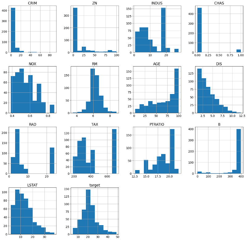
From the descriptive statistics, I saw that the “proportion of residential land zoned for lots” and “proportion of non-retail business” were both predominantly zero. The “per capita crime rate” also had an average value equals to its upper quartile. So we can already expect that they have positively skewed distributions. We must know our statistics well enough to know what to expect even before we plot the data.
Last but not least, I plot the histograms of all the features:
hist = df.hist(figsize=(20,20))

Most of the distributions were not normal. I decided to take note of this and revisit this problem later.
Correlation Analysis and Data Visualization
If your features and target are numerical, you must perform correlation analysis as the first step to understand the bivariate properties of your data. The most common method should be the Pearson correlation. However, I decided to do something new with the correlation analysis, which will be further discussed below.
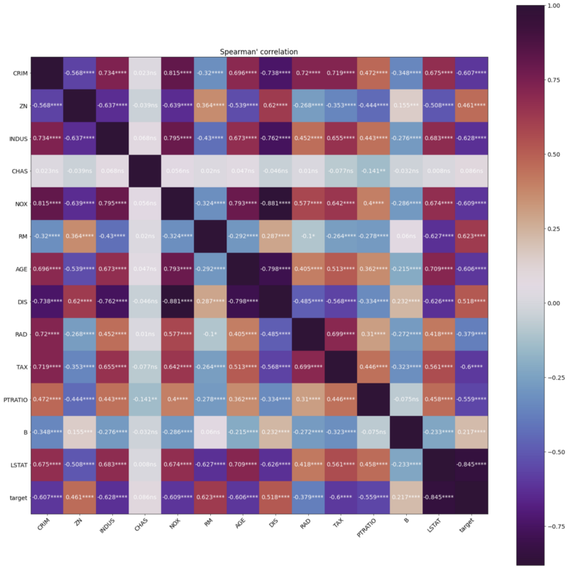
It is worth mentioning that I spent quite some time figuring out how to best visualize the 14x14 cross-correlation matrix. Displaying 196 numbers without any annotation will be very confusing for my viewers. I finally decided to use a heat map to visualize the correlation coefficients:
# plot heatmap of correlation coefficients
fig, ax = plt.subplots(figsize=(20,20))
im = ax.imshow(corr.correlation, cmap='twilight_shifted')
ax.set_xticks(np.arange(nf+1))
ax.set_yticks(np.arange(nf+1))
# ... and label them with the respective list entries
ax.set_xticklabels(df.columns)
ax.set_yticklabels(df.columns)
# Rotate the tick labels and set their alignment.
plt.setp(ax.get_xticklabels(), rotation=45, ha='right',rotation_mode='anchor')
# annotate correlations on top of figure
idx = 0
for i in range(nf+1):
    for j in range(nf+1):
        if i!=j: # omit diagonal
            text = ax.text(j, i, str(corr.correlation[i, j].round(3))+''+str(p_sig[idx]), ha='center', va='center', color='w')
 #rounding to 3 decimals
        idx += 1ax.set_title('Spearman\'s correlation')
fig.tight_layout()
fig.colorbar(im)
plt.show()

Be sure to explain what your figure means and the definitions of each color. Also, comment on any patterns you can see and try to give some interpretations.
Feature Selection
To test the individual effect of each variable, I used a linear model with each variable as a regressor and format the outputs nicely in descending order of p-values into a table for viewing:
f_regr = sklearn.feature_selection.f_regression(X, y, center=True)
f_regr_df = pd.DataFrame()
f_regr_df['Feature'] = data['feature_names']
f_regr_df['F score'] = f_regr[0]
f_regr_df['p value'] = f_regr[1]
f_regr_df.sort_values(by='p value')
I also conducted an L1-based feature selection as well as Recursive Feature Elimination.
There are many feature selection methods out there you can choose from. The key in a Data Science assessment is to give rationales and provide support for the methods you choose. Interviewers want to see your Data Science communication skills, not the best feature selection method ever on an unrealistic toy dataset.
Linear Models
Linear models should be your go-to tools for most data science tasks. If linear models perform well on your data, then it may not be necessary for you to explore non-linear models which require more hyperparameter tuning and computational resources.
In my submission, I started with the most basic linear regression as my baseline model. Then I applied regularization techniques to see if they improve model performance. I made sure to explain the effect of each regularization method in my submission.
Something New
Assuming you have done all the things that other candidates might have done, it’s time to stick out a mile. Think about what you can do differently, out of the ordinary. Consider techniques that can be an alternative to a more popular technique. That being said, it is important to make sure that you provide a rationale in doing so, and the technique you have chosen benefits the model.
The Choice of Spearman’s Correlation over Pearson’s
The first new thing I did was to use Spearman’s correlation rather than the more common Pearson’s correlation. Spearman’s correlation may be more well-known to be applied on ordinal variables, but it also has great benefits to be applied on continuous numerical data because it does not carry any assumptions on their distributions. Contrarily, Pearson’s correlation coefficient assumes both variables to be normally distributed and their relationship is linear.
The variables in my dataset were both ordinal and continuous, and the histograms told me that they are not all normally distributed. Based on these observations, I used Spearman’s correlation and explained in my submission my choice and the advantages brought by this choice.
Yeo-Johnson Power Transformation
I mentioned above that I made a note of the fact that most of my variables were not normally distributed. After some research, I found a solution that I wanted to present to my interviewer, the Yeo-Johnson power transformation.
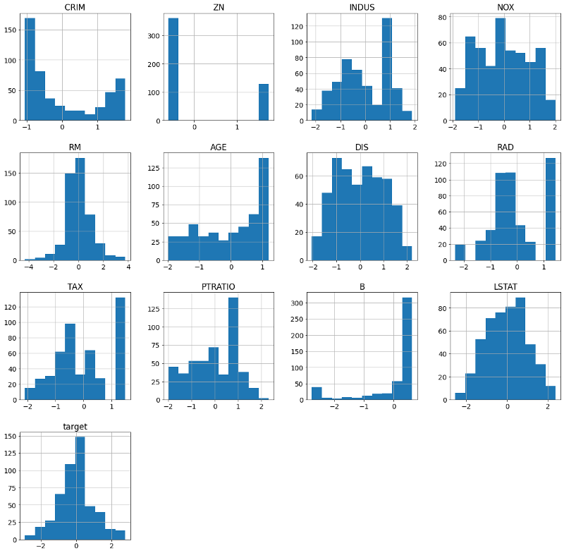
Since this might be something my interviewer has never heard of, I put in extra effort to explain why we needed to power transform — because a lot of common models assume variables to be normally distributed. I also visualized the result of the transformation by replotting all the histograms:

The histograms show that not all transformations were successful. But we can see that a few variables had become much more normalized. I then reapplied some of the models trained on the original data on the newly transformed data to see if there was any change in model performances.
Show off your more advanced machine learning skills, even if the dataset might not require it
Towards the end of my report, I showed off some more advanced machine learning skills by applying the Random Forest Regressor with cross-validation
rf = RandomForestRegressor(random_state=1)
random_grid = {    'bootstrap': [True, False],    'max_depth': [10, 20, 30, 40, 50, 60, 70, 80, 90, 100, None],    'max_features': ['auto', 'sqrt'],    'min_samples_leaf': [1, 2, 4],    'min_samples_split': [2, 5, 10],    'n_estimators': [200, 400, 600, 800, 1000, 1200, 1400, 1600, 1800, 2000]}
rf_random = RandomizedSearchCV(estimator = rf, param_distributions = random_grid, n_iter = 100, cv = 3, verbose=2, random_state=1, n_jobs = -1)
# Fit the random search model
rf_random.fit(train_X, train_y.ravel())rf_random.best_params_
and Support Vector Regression (SVR) with the RBF kernel.
svr = SVR()
random_grid = {    'C': [0.1, 1, 10, 100],    'gamma': ['scale', 'auto']}
svr_random = RandomizedSearchCV(estimator = svr, param_distributions = random_grid, cv = 3, verbose=2, random_state=1, n_jobs = -1)
# Fit the random search model
svr_random.fit(train_X, train_y.ravel())svr_random.best_params_
I also took the opportunity to explain why I didn’t use more complex deep learning methods:
This dataset has a small sample size. Hence, a lot of deep learning methods might not be applicable or we would risk overfitting our data.
To conclude the submission, I let the interviewer know what further improvements I could make if I were given more time:
Ideally, we would want to iterate over the different feature selection methods for each model. This is not done here due to time constraints, so a lot of the models just used one feature selection method based on intuition.
Something Borrowed
First and foremost, do NOT plagiarize. Despite calling this “borrow”, I do not mean that you should just look at what others have done the same dataset and put it in your submission.
When you receive your assignment and only get XX hours to finish it, you might be tempted to start right off the bat and dive right into the dataset. While it is a good idea to take a look at the description of the dataset and the task, take your time to do your research. Here are a few basic steps you can follow:
- Identify whether your task is a classification, regression, or other unstructured/unsupervised tasks.
- Go to your favorite software package, in my case scikit-learn, and check out the available functions they have for your task, e.g. this page on supervised learning. You may know a lot of other packages or algorithms out there, but sticking with the most common ones ensures your interviewer or recruiter can reproduce your results and you don’t need to reinvent the wheel.
- Go to Kaggle Notebooks, search for notebooks on the exact dataset if yours is a well-known one, or search for keywords related to your dataset, e.g. “predict house price”. Do not copy others’ codes, but browse over enough notebooks to get a sense of what must be included in your submission. This will be your “something old”.
- At this point, you can probably start programing. Starting with descriptive statistics and some preliminary analyses, you will probably identify special properties of your dataset. (In my case, the non-normal distributions.) Make note of these characteristics of your dataset as these will be the foundation of your “something new”.
- Research for your “something new”. Formulate a good question so that a simple Google search is going to give you the result you want. In my case, I searched for “How to transform non-normal data sklearn” and the second result is the tutorial page on Scikit-Learn documentation that I needed.
Takeaways
Every data science exercise is different. In this case, I was asked to do a simple regression task, while you may be asked to do a classification or natural language processing (NLP) task instead. The key takeaway from this article is not the technical bits, but the overall structure that you can apply to your own assessment to stand out.
In addition to showing your recruiter or interviewer that you know all the old stuff, make sure that you give them something new so that they know you are different from all the other candidates. Last but not least, it is worth researching other people’s work before diving right into the assessment. Borrow their knowledge, not their work.
Wish you all success in your next job interview. Or should I say, wish you luck in finding The One… career you want to spend the rest of your life in.
About the author: I am a freelance data scientist and ML engineer. I provide custom solutions for your company’s data science and machine learning needs. For more info, please visit https://www.linkedin.com/in/cathieso/.
喜欢我的文章吗?
别忘了给点支持与赞赏,让我知道创作的路上有你陪伴。
发布评论…